A comprehensive retail experience that empowers sales associates in brick-and-mortar stores.
 Google Shopping asked my team to investigate opportunities for improving the retail experience using Google's product data. more
 Our research revealed that sales associates were perfectly placed to create a lasting relationship between the shopper and the store. more
 We explored the ways in which we could help these relationships form, and create a virtuous feedback loop to strengthen them over time. more
 We created Opus – a system that provides the associate with the support he needs to give his customer the optimal shopping experience. more

Context
Google Shopping asked my team to explore ways in which they could engage with the brick-and-mortar shopping experience. They recognized that despite the shifts occurring in retail, the salesperson was still the primary interface for the majority of shoppers, capable of converting casual shoppers to loyal and repeat customers. Google was interested in learning more about the current state of the shopping experience, and in finding opportunities for its data and services to empower salespeople and retailers.
Google asked us to look beyond special offers and transactions, and focus on the customer's experience before the purchase. They wanted us to develop a solution that benefitted three stakeholders – Google Shopping itself, the retailers and sales associates that would use the product we designed, and customers that came to the stores.
My roles
- Domain & field research – Dove deep into existing domain knowledge, and uncovered customer insights through extensive field research.
- Ideation and visioning – Synthesized key findings from qualitative research data, and converted them into visions that aligned with the client's goals.
- Design execution & validation – Created wireframes, mockups, and high-fidelity prototypes. Conducted user testing to validate the design at each stage, and addressed any issues that were discovered.
- Leadership – Evangelized ideas internally and led design critiques within the team to drive decision-making. Documented and presented the team's progress to our advisors and client.
Discovery
In order to familiarize ourselves with the domain, we gathered information from a broad array of sources, from conventional experts such as retail executives to first-hand accounts written by sales associates about their experiences. We also performed a territory analysis to identify the unique advantages of the different kinds of brick-and-mortar, online, and omnichannel shopping experiences. A theme emerged from our research – while customers increasingly migrated to online shopping as technology improved, they still valued the tactile, personalized service that only a brick-and-mortar store and a sales associate could offer. Despite Google's expectations, sales associates actually had few gaps in their knowledge, but customers often found them more difficult to access and considered them less trustworthy than online sources.
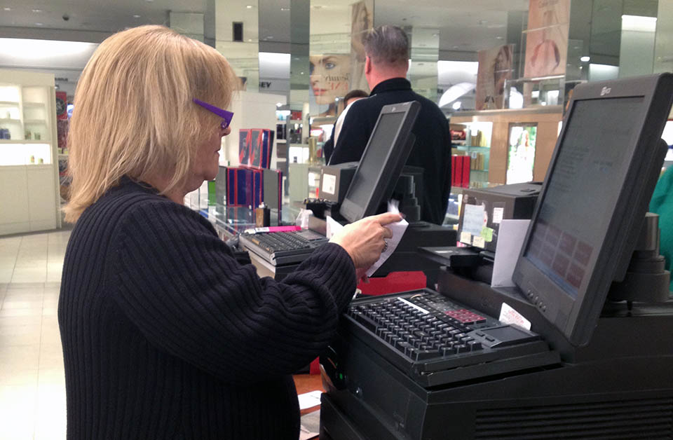
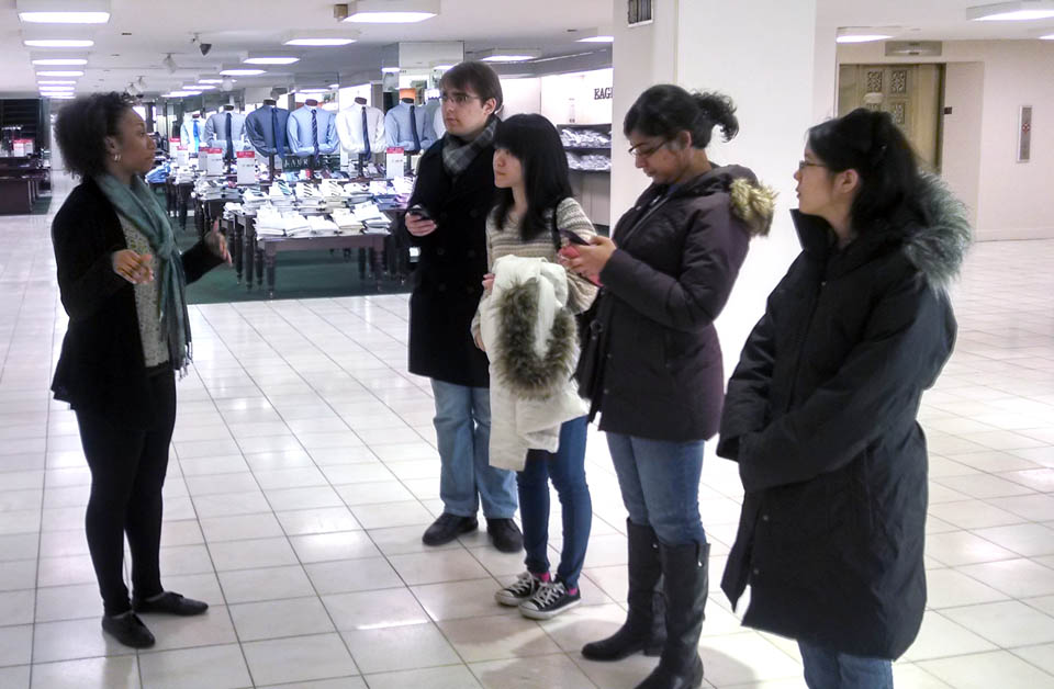
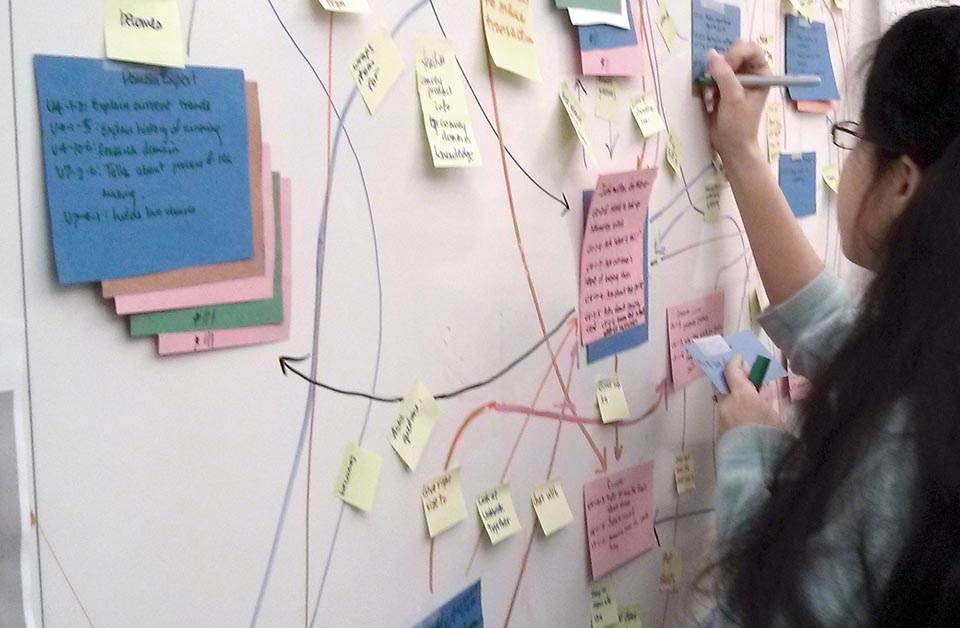
We took to the field ourselves to validate and contextualize our findings, visiting 42 stores overall. In order to gain empathy with our stakeholders, we performed guerilla research, diary studies, and contextual inquiry with both shoppers and salespeople. We recorded a number of field stories that exemplified the potential for delightful, serendipitous interactions between shoppers and salespeople, or identified pain points and opportunities for the team to address. Overall, we captured over a thousand individual data points that we used to construct flow models, sequence models, and affinity diagrams that led us to concrete insights.
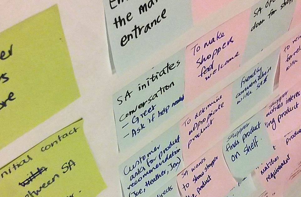
From this research, we produced the key discoveries. We found that online shopping could be complementary to in-store shopping, forming the basis of omnichannel strategies. The brick-and-mortar store was a valuable part of the equation – it served as a fully immersive and tactile experience, where sales associates could help shoppers filter many choices and arrive at a decision without anxiety. This interaction became the basis for a long-lasting personal relationship between the customer and the store.
Design Process
In order to stay focused in the face of many opportunities, we developed a set of design principles that helped us bring together the best of brick-and-mortar and online retail. Chief among them was that the technology should support the natural human interaction between a customer and sales associate, not force either one to focus mainly on a device or interface. We also decided to give shoppers the freedom to interact with the enhanced experience as much or as little as possible, allowing sales associates to handle purchases the way they saw fit.
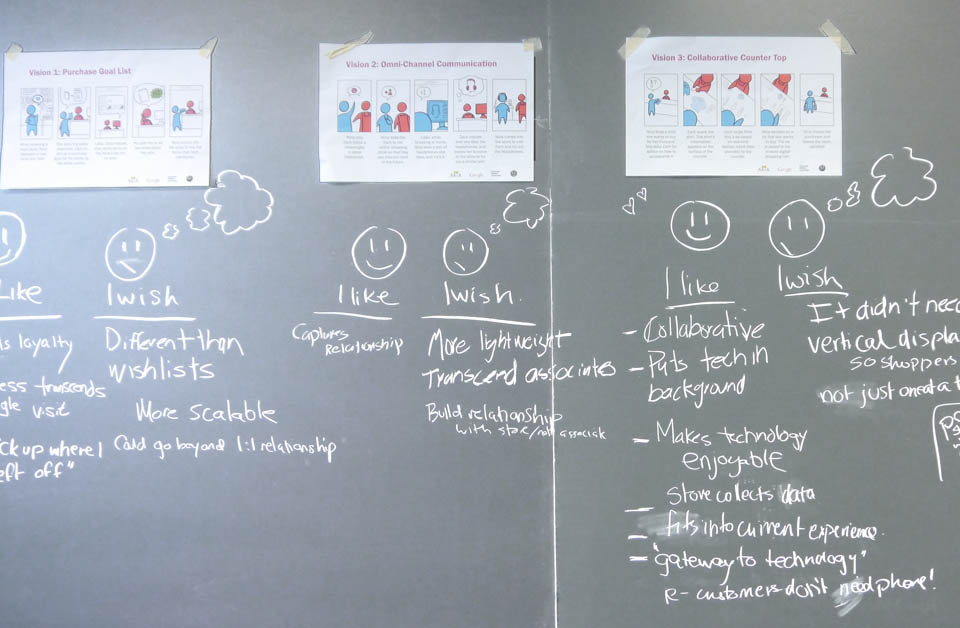
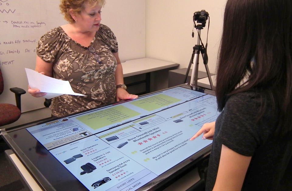
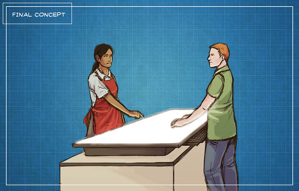
Even within these boundaries, we generated many ideas, and filtered them down based on the cost-benefit ratio for each of the three stakeholders. We explored different form factors for experiences that would be driven by the customer, the sales associate, or a combination of the two. We tested the internally successful ideas on likely users, through scenario storyboards and then paper prototypes. This testing winnowed the concept down to what would become the four components of Opus – the smart countertop, in-store help request, after-purchase support, and shopper profile that linked the experiences together.
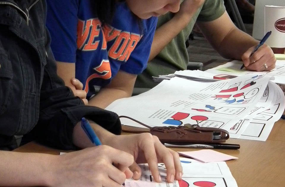
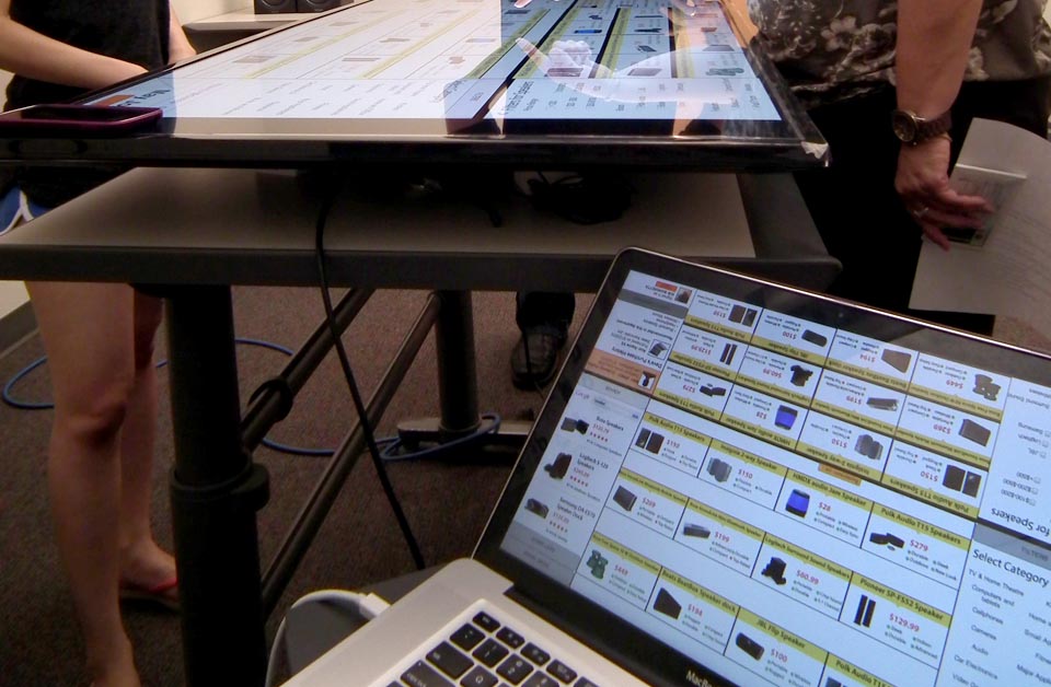
Based on this early testing, we created a Wizard of Oz prototype for the experience, using an operator behind the scenes to enhance an Axure interface. This technique allowed us to experiment with various task flows without committing budget to expensive equipment we weren't sure we would need. We tested for physical interactions as well as taps and swipes. During testing, sales associates would frequently reach over to manipulate the shopper's side of the table, an experience that some users considered an invasion of personal space. We were able to solve this issue with a larger screen, and the addition of a shared area in the middle of the interface that both the sales associate and the shopper could manipulate.
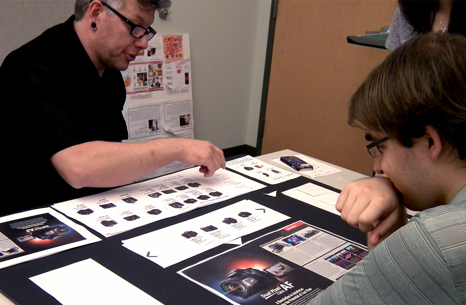
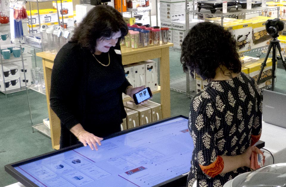
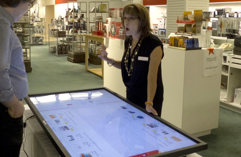
Our findings helped us justify the purchase of a touch-screen overlay, allowing us to develop a Javascript-based prototype of the smart countertop. We brought it into Macy's for testing with sales associates in the home goods department. Placing it within a real store allowed us to ensure that the device would fit into the existing flow of a stakeholder's operations, and that salespeople would not need onerous training to master Opus. To our great relief, the sales associates (even those in their 50s and 60s) were able to use this brand-new form factor after a five-minute orientation, and understood it well enough to explain it to shoppers.
Outcomes
Opus extends through the entire shopping experience, from the moment a customer enters the store to post-purchase interactions. Retailers can adopt as much or as little of the experience as they choose, and the shopping experience is improved if even one component is implemented.
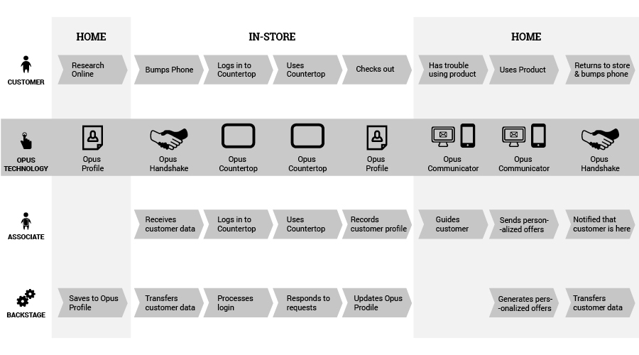
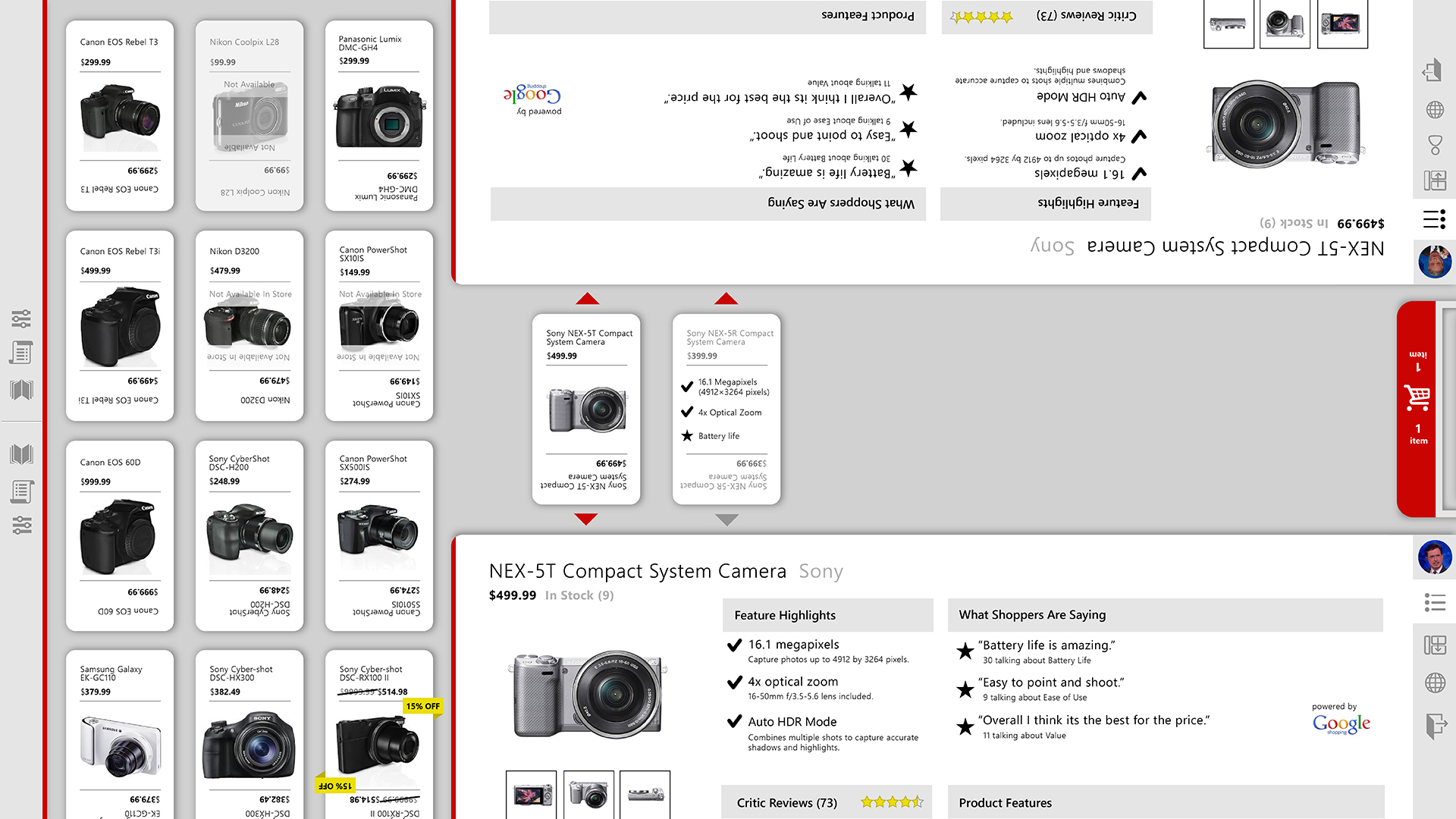
The most visible component of the experience is the Opus Countertop - a collaborative platform for sales associates and shoppers to browse and compare products. The shopper and the sales associate both operate the touch-screen interface at the same time, using precise swipes to move product cards short distances and coarse flicks to transport them across the screen without needing to drag their arms too far.
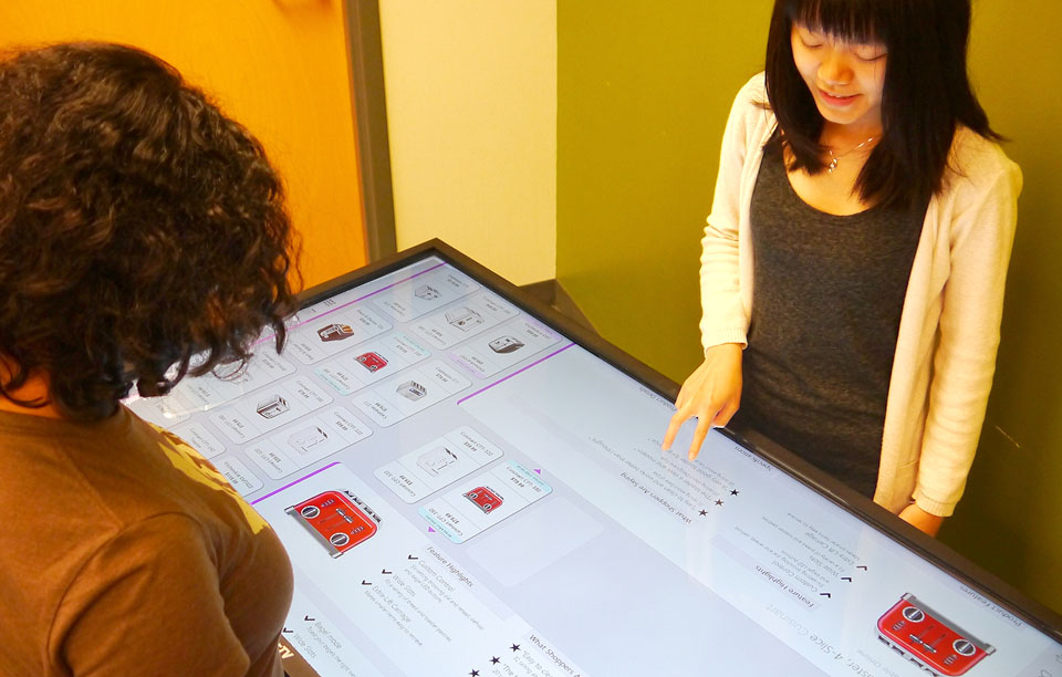
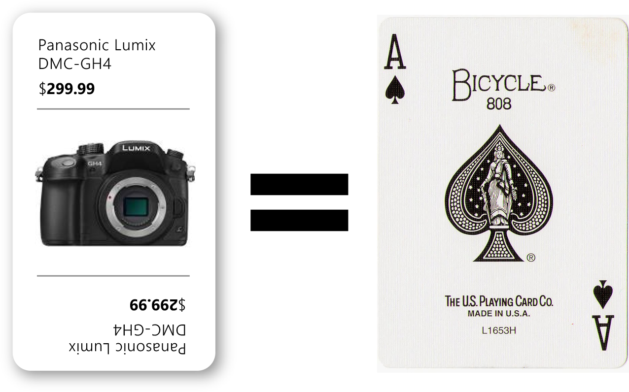
Products flow from the scrolling catalog on the left into the consideration panel in the middle. Each user can drag products towards themselves to see details and compare items on their side of the interface. To make sure that both users can read the product name and price, we designed the product cards to resemble playing cards.
The interface color is intentionally muted to allow products and retailer branding to stand out. We took care to create no hitbox smaller than 1.5 cm, so that users could manipulate the interface easily. The UI uses a typeface with open counters and a minimum x-height of 3.5mm to make sure that text is legible even on a low resolution display.
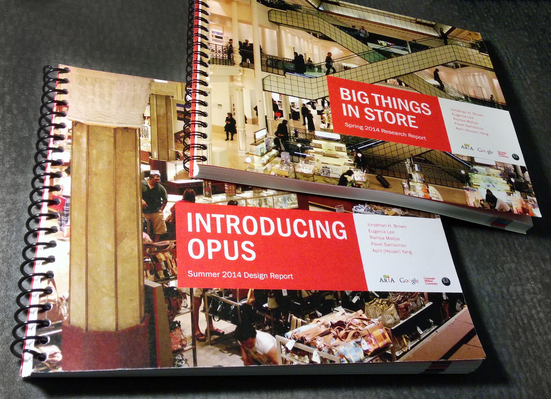
Our complete research findings and design process are documented in two report books.